Aura Dashboards
Data Analysis and Visualization
Role
UX/UI Designer
Industry
Data
Duration
3 months

Data Dashboards for Hospital Supplies
I designed data dashboards for a business unit specialized in hospital supplies, helping transform complex datasets into clear, actionable insights. The goal was to support cross-functional teams in making faster, data-driven decisions in a high-stakes environment.
My role involved:
Structuring information for clarity and usability
Choosing the right visualizations for each type of data
Ensuring a smooth, intuitive user experience
I worked closely with data analysts to align the dashboards with business goals and operational needs, improving visibility and control over critical supply metrics.
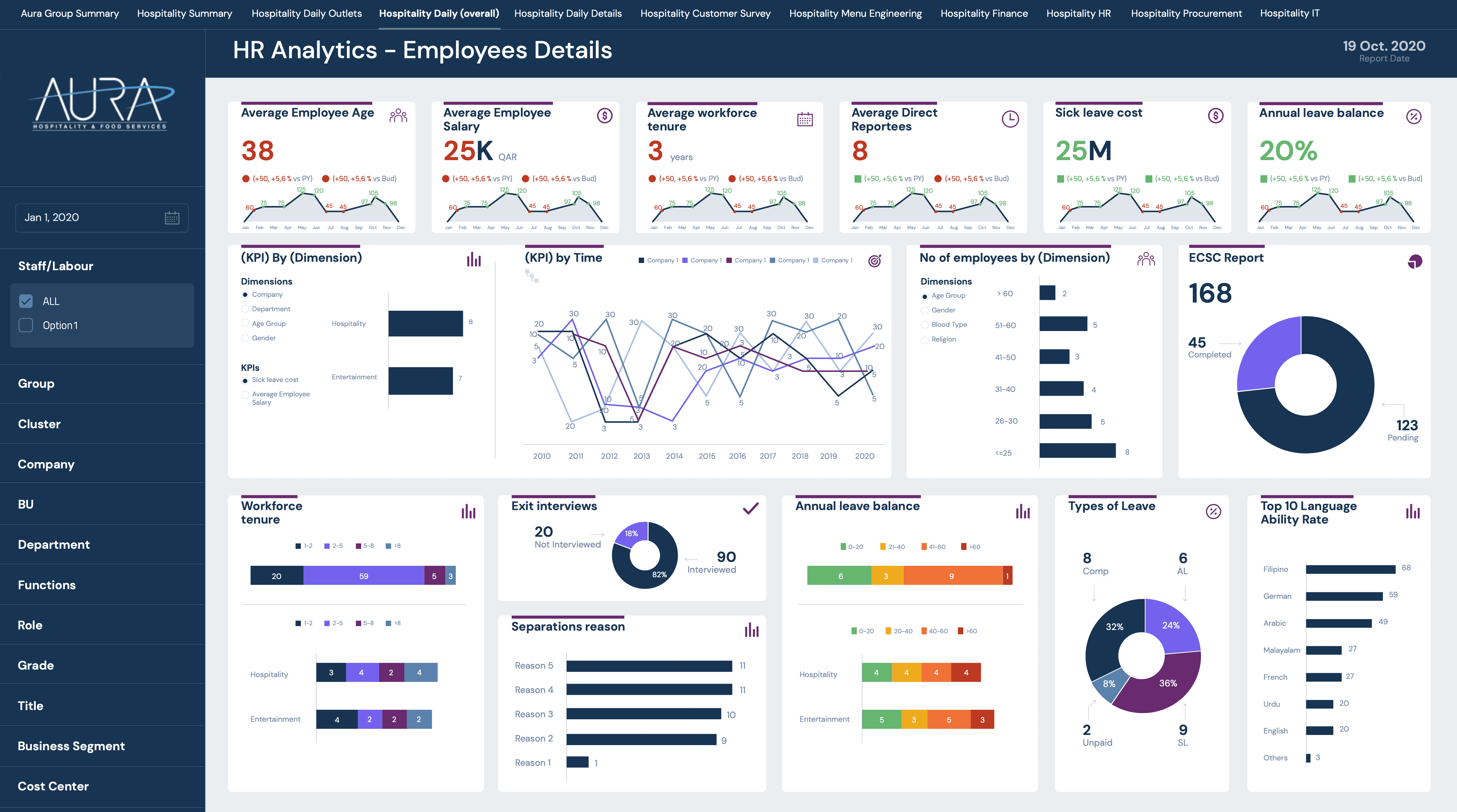
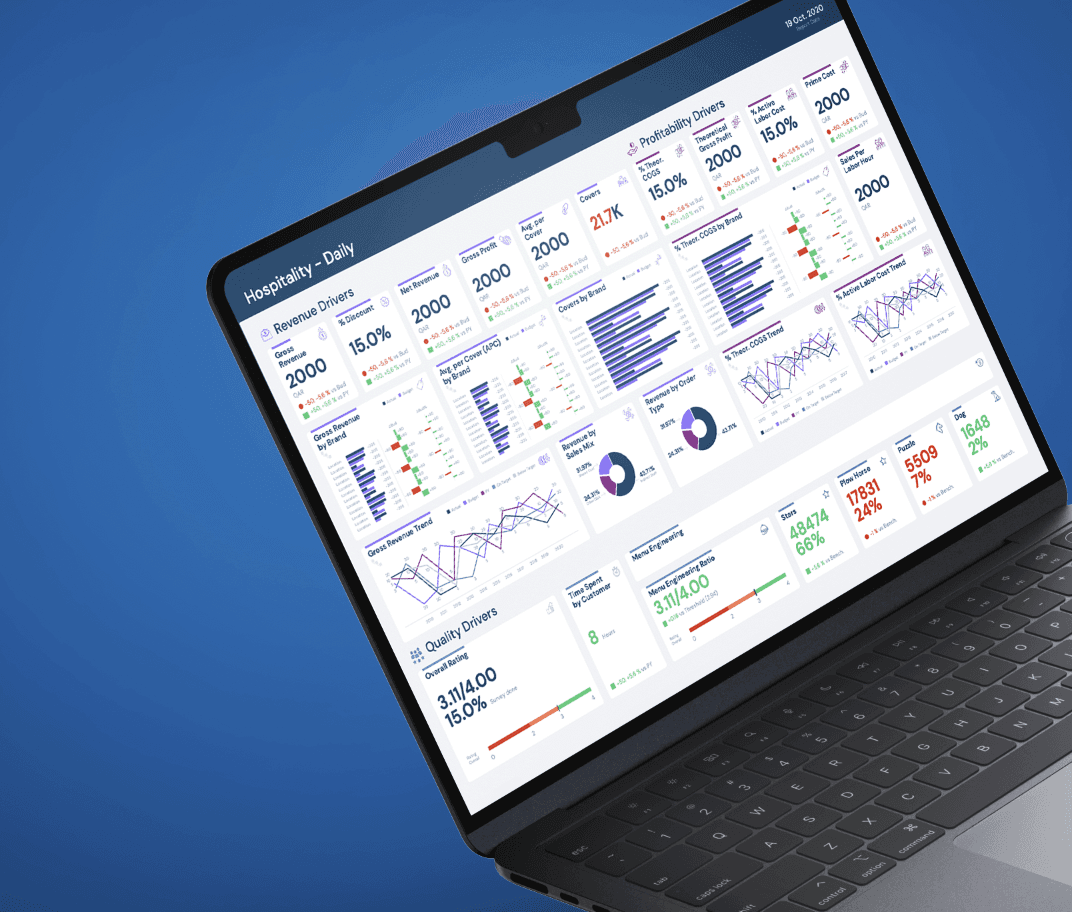
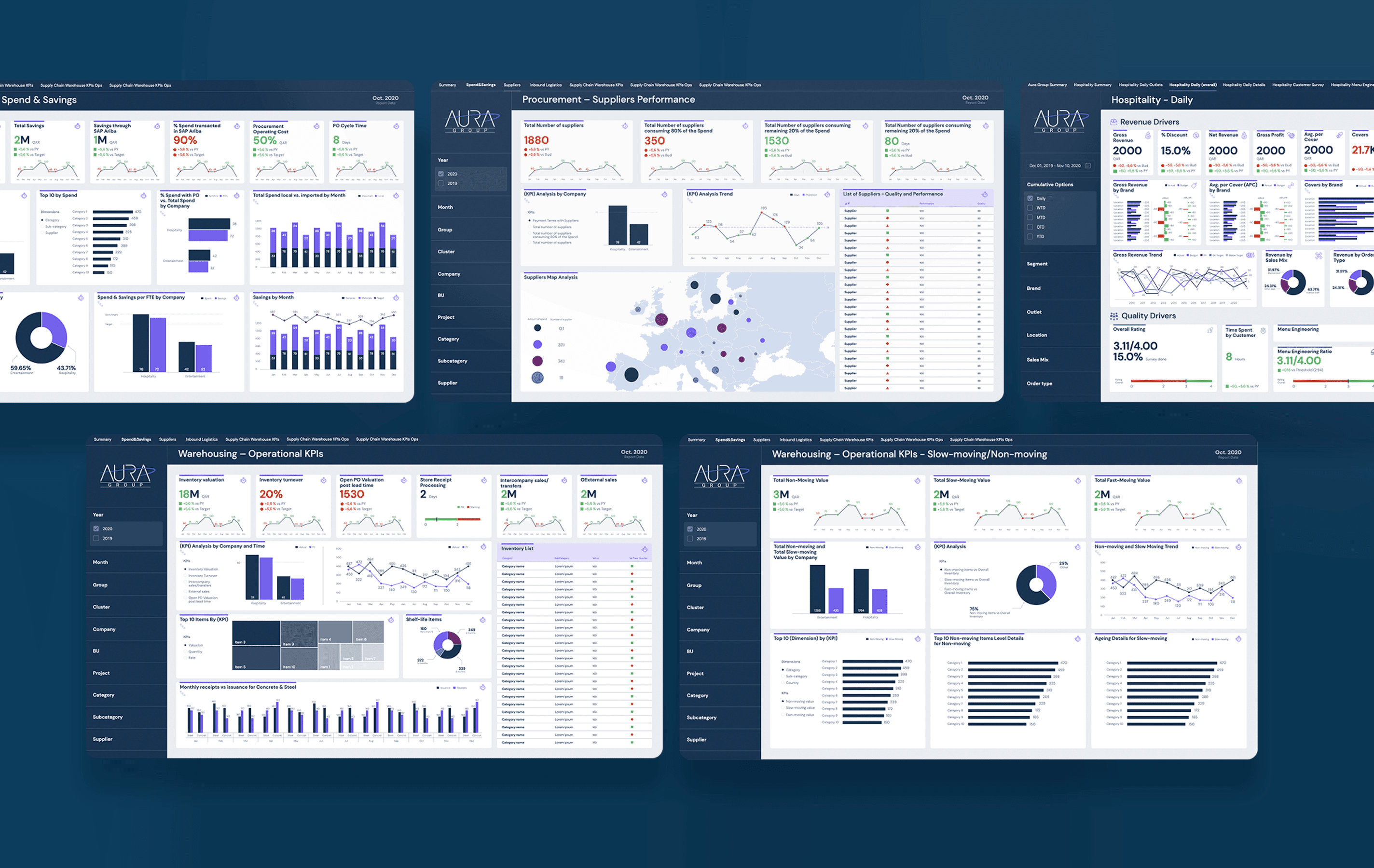
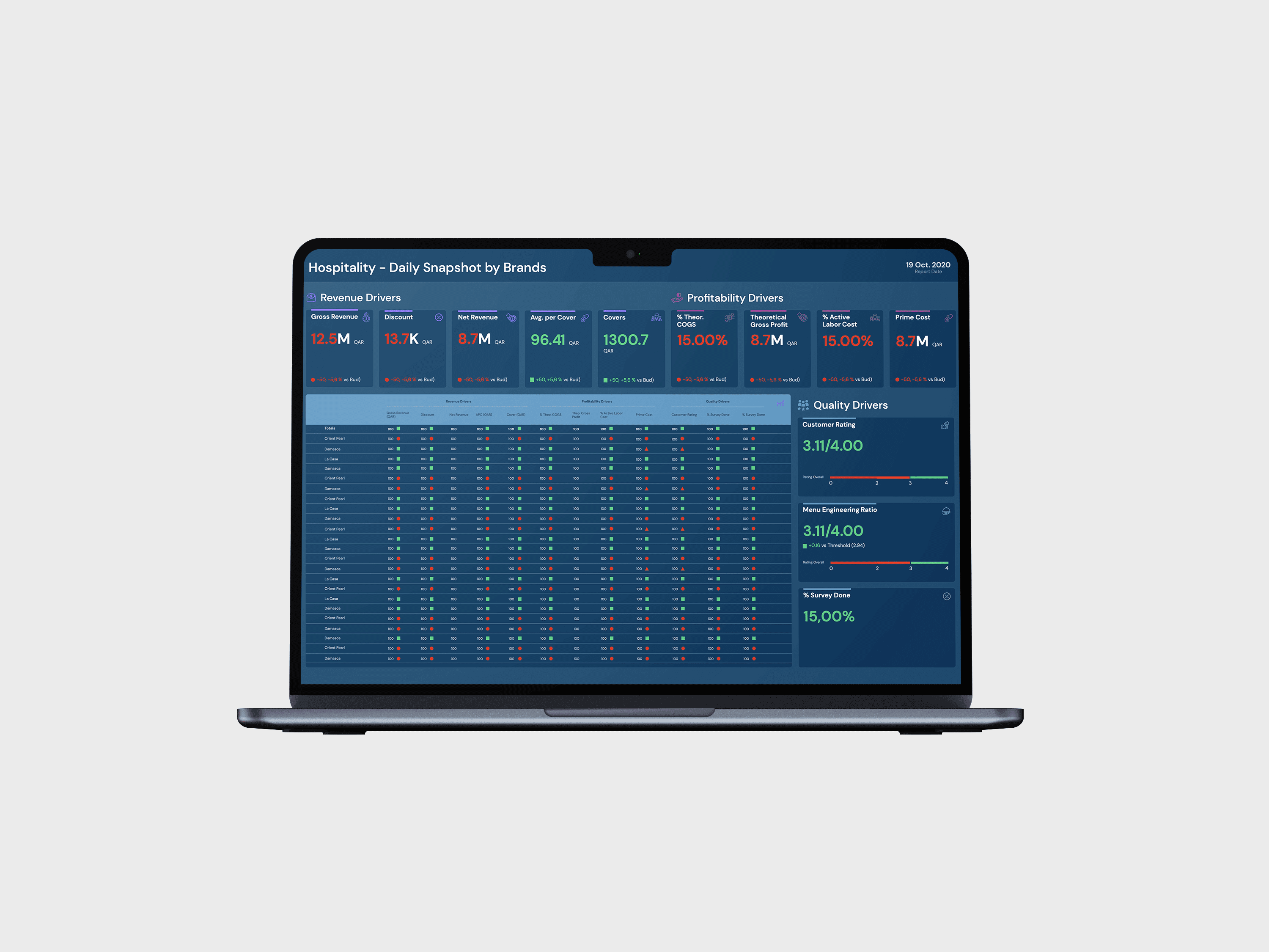
Visual Design
The visual design of the dashboards was carefully crafted to ensure clarity, readability, and immediate insight extraction. Once the information architecture and wireframes were defined, the focus shifted to enhancing the visual layer to support both usability and business comprehension.
A consistent and balanced color palette was applied to differentiate data types and guide user attention—using contrast strategically to make key metrics stand out. Typography was chosen for maximum legibility, even at smaller sizes, and aligned across modules for visual harmony.
We used a variety of data visualizations—including bar charts, line graphs, pie charts, and tables—selected based on the type and complexity of the data being displayed. Each component was designed to support fast interpretation and comparison.
Visual hierarchy was established through size, spacing, and color coding to highlight trends, alerts, and anomalies. The use of white space helps reduce cognitive load and enhances scannability across the entire layout.
This approach ensured that even complex KPI sets could be read and understood quickly by stakeholders from different backgrounds—including supply chain managers, finance teams, and logistics coordinators.

Other projects

HP Printing software
Design of print management software for large format printers

Intestia Salud
Designing a digital health app to connect patients with digestive health specialists

Full Syllabus
Educational platform for medical students designed to transform complex medical content into interactive, structured learning experiences.

Flashsale
Exploring new ways to interact with flash deals in a Marketplace app.

Hewlett-Packard
Use case of how the material loading process of a large format printer was designed.