Full Syllabus
Educational platform for medical students designed to transform complex medical content into interactive, structured learning experiences.
Role
UX/UI Designer
Industry
EdTech / Scientific-Medical
Duration
8 months

The Challenge
Design a learning platform that enables medical students to navigate and understand highly technical content in a structured and efficient way.
The main challenge was transforming dense and complex information into a clear digital experience that:
→ Enables quick access to specific subtopics
→ Guides students through a logical progression
→ Integrates assessment within the learning flow
→ Scales across multiple medical disciplines
The real challenge was turning complex medical content into a structured experience where architecture and design actively work to simplify complexity and support progressive learning.
My Approach
1. Research & Discovery
The research team conducted interviews with medical students across different academic years to better understand:
→ How they study before exams
→ What frustrates them about traditional study materials
→ Which digital tools they currently use
Based on this research, clear patterns emerged:
→ Students study in focused 20–40 minute blocks
→ They need to quickly locate specific subtopics
→ Visual explanations improve understanding of complex content
→ Immediate self-assessment reinforces confidence and retention
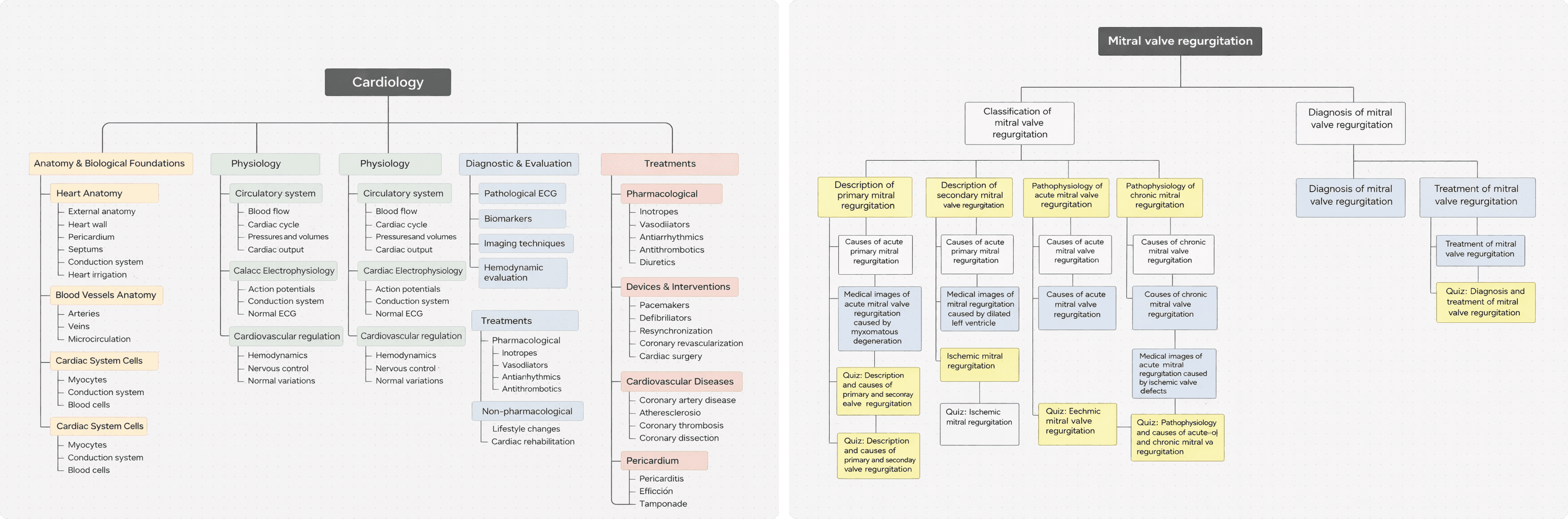
In parallel, we analyzed the existing medical content to reorganize it into a clearer and more coherent structure, grouping related concepts and defining hierarchies that would facilitate its adaptation to a digital environment.
2. Architecture Definition
Based on the research insights, I defined the structural model of the product to adapt medical content to real study patterns.
Structural Model
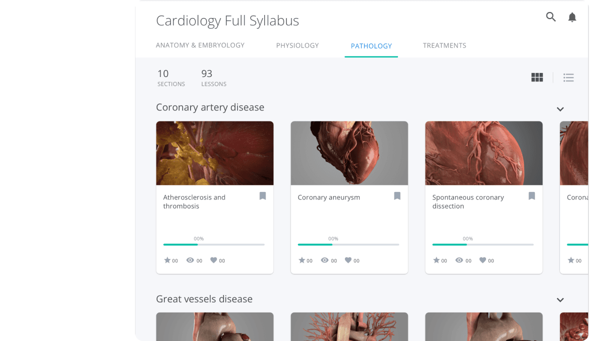
Discipline → Topic → Lesson → Subtopic → Integrated Assessment
Key Decisions
→ Modularize content into self-contained lessons aligned with short study sessions
→ Design a clear hierarchy that enables direct access to specific subtopics
→ Integrate assessment within the learning flow rather than as a separate step
→ Incorporate visible progress indicators to reinforce motivation and continuity
The objective was for the architecture to actively guide learning, reducing friction and cognitive load.
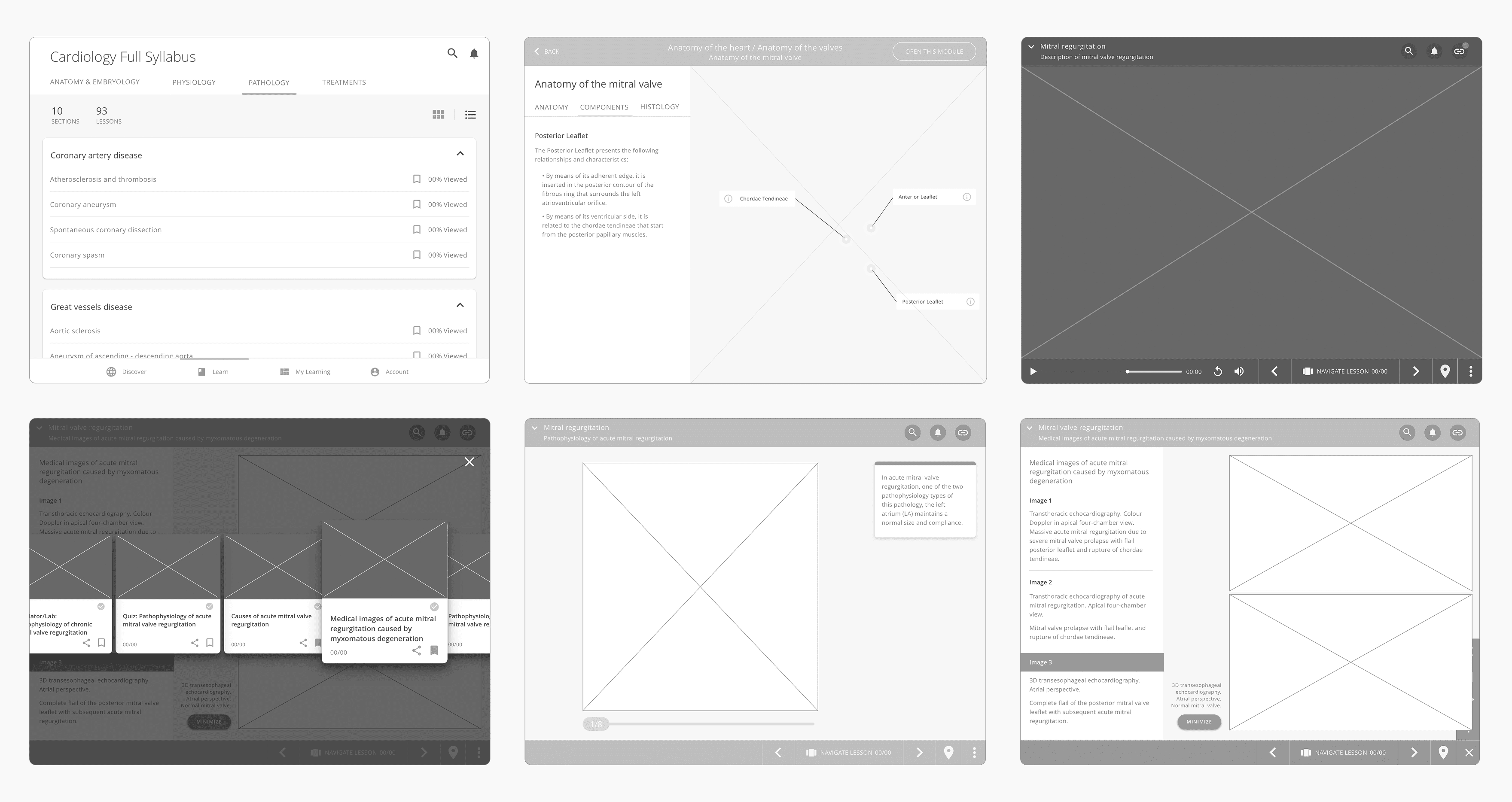
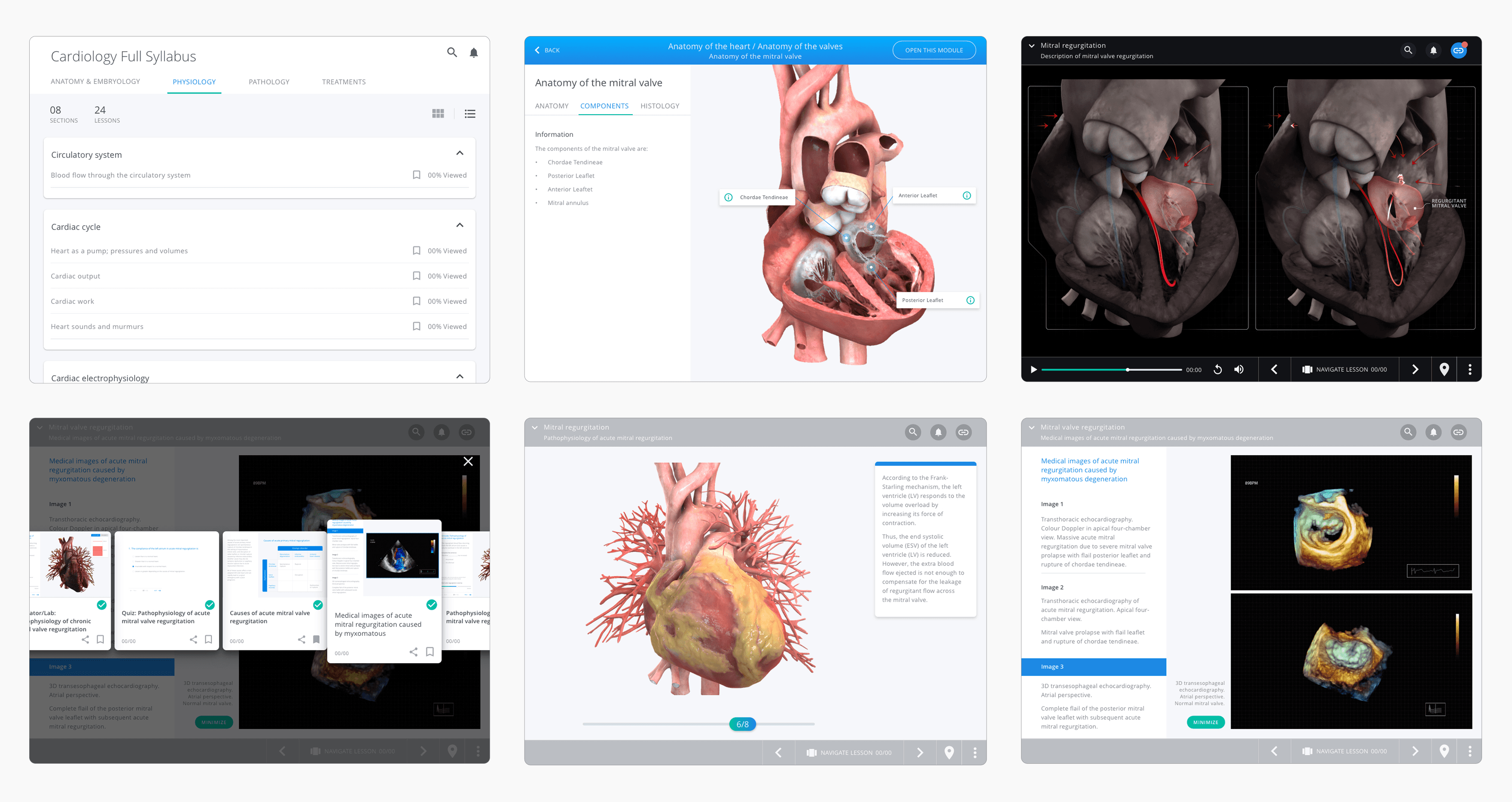
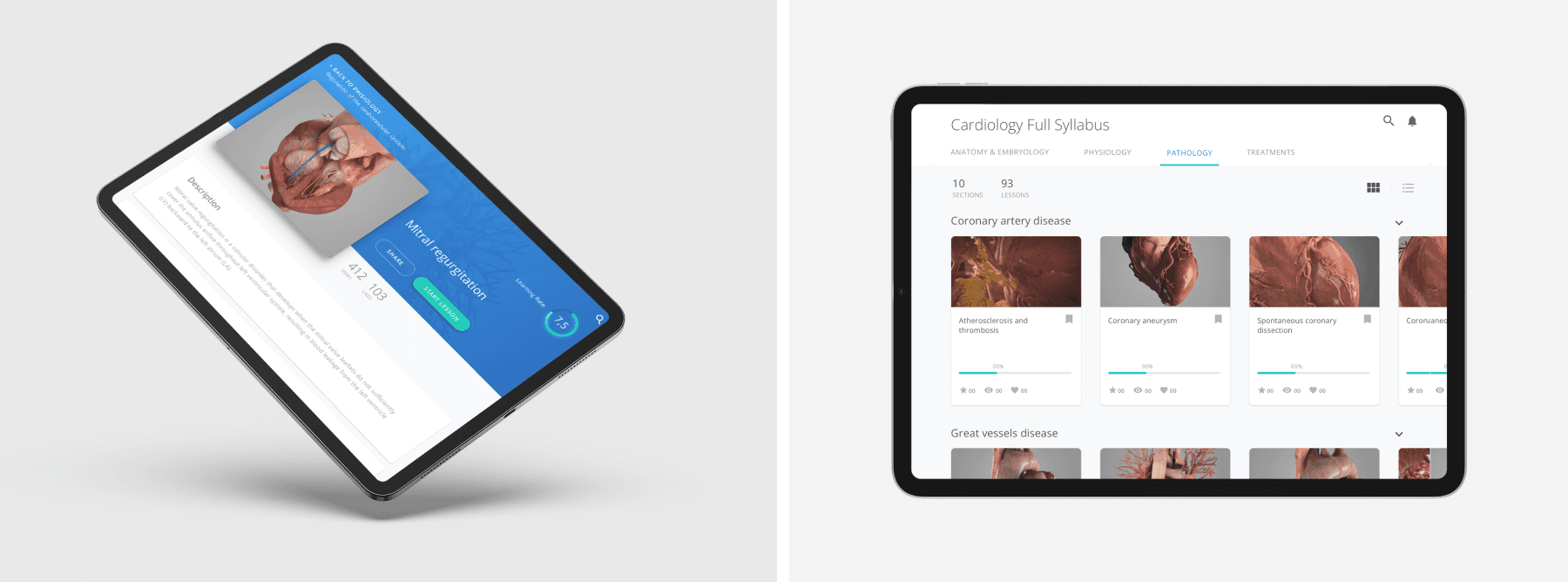
3. Interface Design
Medical content is dense and visually complex.
The interface needed to support comprehension rather than compete with it.
The focus was not on making it visually attractive, but on designing a visual layer that structured information clearly and enabled progressive reading.
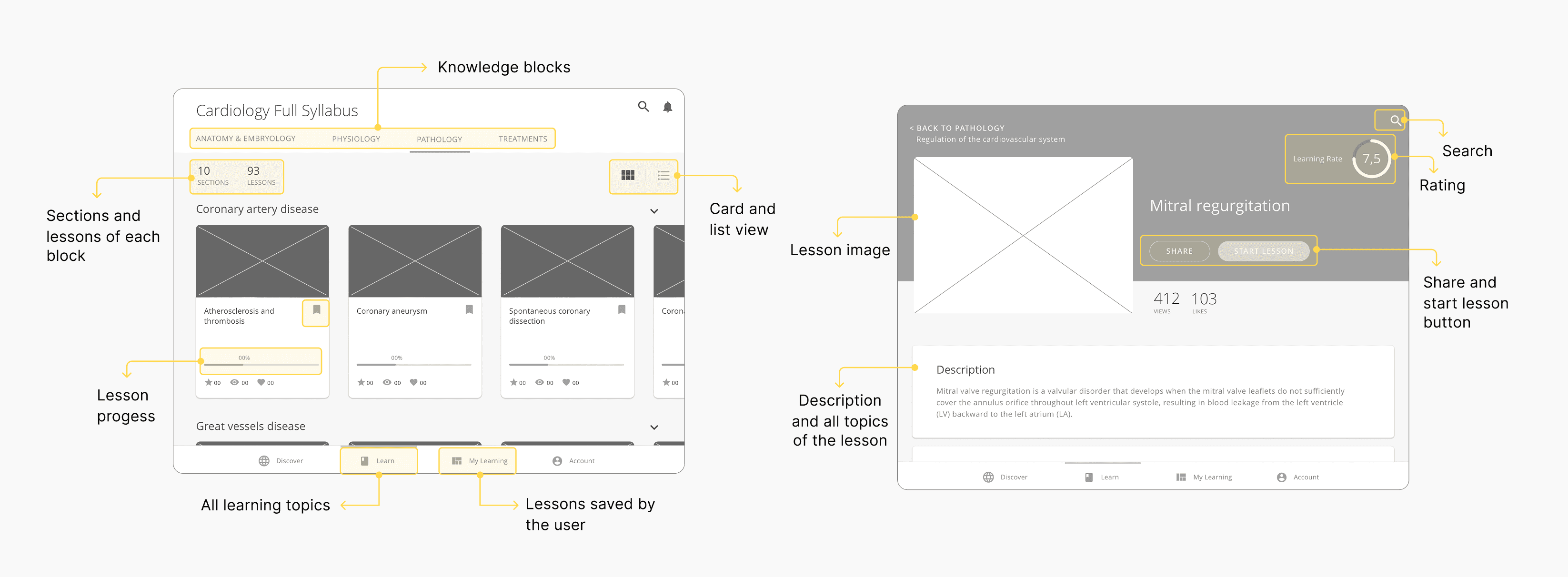
Design Principles Applied
→ Clear visual hierarchy to prioritize key concepts over secondary information
→ Spacing and content blocks optimized for sustained reading without fatigue
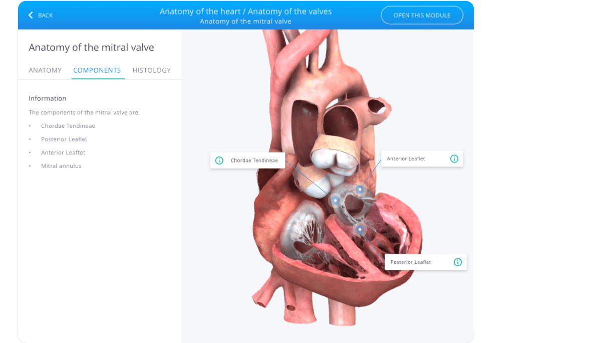
→ Integration of interactive anatomical models as conceptual support rather than decorative elements
→ Explicit separation between theoretical content and assessment to avoid cognitive interruption
The objective was for the interface to reinforce the previously defined architecture and support learning in a natural and structured way.
4. Design System
To ensure the product could scale across additional medical disciplines, I developed a modular design system aligned with the defined architecture.
Key Decisions
→ Reusable components for lessons and structured content blocks
→ Standardized assessment modules integrated within the learning flow
→ A typography scale optimized for sustained reading
→ A functional color system defining navigation, action, and feedback states
Impact
This system enabled:
→ Faster design iteration when introducing new disciplines
→ Smoother developer handoff through consistent patterns
→ Visual and structural coherence as the product expanded
Other projects

HP Printing software
Design of print management software for large format printers

Intestia Salud
Designing a digital health app to connect patients with digestive health specialists

Flashsale
Exploring new ways to interact with flash deals in a Marketplace app.

Hewlett-Packard
Use case of how the material loading process of a large format printer was designed.

Aura Dashboards
Data Analysis and Visualization